This sub-page of the Data Analysis page displays selected plots of the data values from the Data Entry Sub-page.
Plot / Graph Type |
|
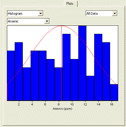
Histogram |
The Histogram is a plot of the fraction of the n observed data that fall within specified data bins. A histogram is generated by dividing the x axis (range of the observed data values) into bins and displaying the number of data in each bin as the height of a bar for the bin. The area of the bar is the fraction of the \(n\) data values that lie within the bin. The sum of the fractions for all bins equals one. A histogram is used to assess how the \(n\) data are distributed (spread) over their range of values. If the histogram is more or less symmetric and bell shaped, then the data may be normally distributed. |
Box and Whiskers |
The Box and Whiskers plot is composed of a central box divided by a line, and with two lines extending out from the box, called the whiskers. The line through the box is drawn at the median of the n data observed. The two ends of the box represent the 25th and 75th percentiles of the \(n\) data values, which are also called the lower and upper quartiles, respectively, of the data set. The sample mean (mean of the n data) is shown as a + sign. The upper whisker extends to the largest data value that is less than the upper quartile plus 1.5 times the interquartile range (upper quartile minus the lower quartile). The lower whisker extends to the smallest data value that is greater than the lower quartile minus 1.5 times the interquartile range. Extreme data values (greater or smaller than the ends of the whiskers) are plotted individually. A Box and Whiskers plot is used to assess the symmetry of the distribution of the data set. If the distribution is symmetrical, the box is divided into two equal halves by the median, the whiskers will be the same length, and the number of extreme data points will be distributed equally on either end of the plot. |
QQ Plot |
The Q-Q plot graphs the quantiles of a set of \(n\) data against the quantiles of a specific distribution. We show here only the Q-Q plot for an assumed normal distribution. The \( p^{th} \) quantile of a distribution of data is the data value, \( x_p \) , for which a fraction p of the distribution is less than \(x_p \). If the data plotted on the normal distribution Q-Q plot closely follow a straight line, even at the ends of the line, then the data may be assumed to be normally distributed. If the data points deviate substantially from a linear line, then the data are not normally distributed. |
QQ Plot provided courtesy of ProUCL.
Gilbert, R.O. 1987. Statistical Methods for Environmental Pollution Monitoring, Wiley, NY.
ProUCL. 2004. ProUCL Version 3.0 User Guide April 2004. Available for download from http://www.epa.gov/nerlesd1/tsc/tsc.htm
Plot / Graph Type |
|
Box and Whiskers |
This plot is the same as that described above with the following additions: Non-Detects are plotted as blue circles. The vertical line represents the maximum of the detection limits. Portions of the graph below the maximum detection limit are plotted with dashed lines. |
QQ Plot |
This plot is the same as that described above with the following additions: Only Detected values are plotted. The horizontal blue lines represent the detection limits. |
Helsel, D.R. 2005. Nondetects and Data Analysis: Statistics for Censored Environmental Data. John Wiley & Sons, Inc. Hoboken, NJ. pp 43-48.