VSP has many extended features that will be discussed in this section. The beginning user may not need these features, but a more experienced user will find them invaluable. These features expand on VSP's core capabilities. They are useful once a user has identified a basic sampling design and now wants to explore variations of the design, explore features of the design that are not part of the initial selection parameters, and add more capability to VSP.
The extended features fall into three categories:
Features found in Main Menu items: Tools, Options, and View,
Features found in the Dialog Box for individual sampling designs, e.g., the Costs Tab, and the Data Analysis Tab, and
Multiple Areas to be Sampled
For help during this section, please refer to the VSP Help Topic Tool menu commands.
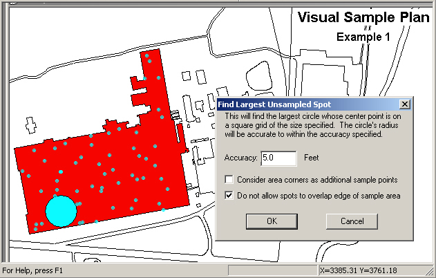
If VSP has generated a sampling design for a Sample Area and you want to know the largest unsampled area, VSP can display this information. The largest unsampled spot is defined as the largest circle that will fit inside a Sample Area without overlapping a sample point.
In Figure 5.1, we opened the VSP Project File Example1.vsp included with the standard VSP installation. From the Main Menu we selectTools > Largest Unsampled Spot. A dialog box shown in Figure 5.1 tells you that VSP will search the Sample Area to find the largest circle that would fit into the unsampled area. The user specifies the accuracy of the circle's radius, which is used as a grid spacing for the scanning algorithm. The smaller the spacing, the longer the search takes, but the more accurate the resulting size and location of the spot. The user is given the option of whether to consider area corners (vertices) as additional sample points. Also, the option is given of whether to allow the spot to overlap the Sample Area, which would only require the center of the spot to be in the Sample Area, and not the entire spot. After hitting the OK button, VSP searches the Sample Area, places the spot on the Map, and displays an Information Box that says the radius of this circle is 205.22 ft. (see Figure 5.2).
Figure 5.1. Largest Unsampled Spot Displayed on Map
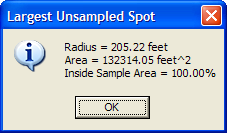
Figure 5.2. Information Dialog Box Showing Percentage of Circle Within the Sample Area
This command clears the current sampling design and removes all samples from the map (including unselected sample areas).
Use this tool to measure distances on the map. After selecting this command, the cursor will become a ruler. Click on the map or enter a location (x, y) on the keyboard to anchor the first point. A line will be drawn from the anchor point to the cursor as you move the mouse. The status bar will also indicate the distance from the anchor point to the cursor. After clicking on a second point or entering a second point on the keyboard, a dialog will appear displaying the distance. In Figure 5.3, we see that the distance from the sampling point to the building edge is 547.33 ft.
Hold the Shift key down to attach either point to an existing point on the map.
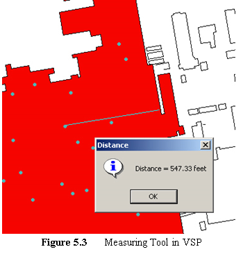
Individual samples can have labels and values associated with them. This tool lets the user design the sample label. Selecting Tools > Make Sample Labels brings up the Dialog Box shown in Figure 5.4. VSP assumes the user will want to assign a unique number to each sample within a Map, so all labels start with "VSP-". Other information can be added to the label, such as the Local X Coordinate and Local Y Coordinate as shown in Figure 5.4, by selecting the information variable names on the list and hitting the Add button. The information can also be added by double-clicking on the list item or by typing in the label format edit box. Once the OK button is pushed, the user sees the current set of Sample Labels in Map View.
Sample labels are discussed in Section 2.4.
 This command displays the Data Analysis Dialog
which allows you to perform basic data analysis without the need to create
a sampling design. After pressing Tools > Analyze Data,
the Data Analysis Dialog appears with the Data Entry Sub-page selected. The
Data Entry sub-page is discussed in Section
2.5.1. The Summary Statistics Sub-page displays basic summary
statistics computed from the individual values from the Data Entry Sub-page. The
Test Sub-page displays results of specific tests on the data values. The
Plots Sub-page displays selected plots of the data values from the Data
Entry Sub-page. These sub-pages are also some of the analytical options
available for many sampling designs.
This command displays the Data Analysis Dialog
which allows you to perform basic data analysis without the need to create
a sampling design. After pressing Tools > Analyze Data,
the Data Analysis Dialog appears with the Data Entry Sub-page selected. The
Data Entry sub-page is discussed in Section
2.5.1. The Summary Statistics Sub-page displays basic summary
statistics computed from the individual values from the Data Entry Sub-page. The
Test Sub-page displays results of specific tests on the data values. The
Plots Sub-page displays selected plots of the data values from the Data
Entry Sub-page. These sub-pages are also some of the analytical options
available for many sampling designs.
This command allows for a geostatistical analysis of sites where data has been collected. For a detailed explanation on geostatistical analysis, see Section 7.3.
This VSP module aims to provide the VSP user with correlation methods, graphical displays, and an automated report for datasets with a large number of analytes (variables) to assess if some analytes could be eliminated or measured less frequently to reduce analytical costs. Figure 5.5 shows the Correlate Analytes dialog.
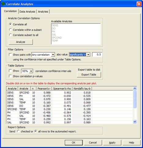
Figure 5.5 Correlate Analytes dialog
There are three Analyte Correlation Options available for how to choose analytes and display correlations. Correlate All will display all pairs of correlations for all available analytes. For the remaining two options, analytes are selected from the list of Available Analytes. Correlate within a subset will display all pairs of correlations for the analytes selected. Correlate subset to all will display all pairs of correlations from the list of available analytes which involve at least one of the analytes selected. Clicking "Analyze" populates the table using the specified option.
Under Filter Options in Figure 5.5, several filters are available for screening out correlations whose absolute values do not exceed a threshold. Clicking the box next to "Show pairs with" activates this filter. Then choose the correlations of interest from the drop down menu: Any Correlations, All Correlations, Pearson's r, Spearman's rho, or Kendall's tau-b. Then select if the absolute value of this value or values has to be significantly greater than the specified value, or if it simply must be greater with no condition of significance. Any Correlations implies that if any of Pearson's r, Spearman's rho, or Kendall's tau-b have absolute values that meet the criteria, the pair of analytes will be displayed. All Correlations implies that all three correlations must meet the criteria. When Pearson's r, Spearman's rho, or Kendall's tau-b are selected, only the correlation chosen is tested against the value specified.
The table in Figure 5.5 shows pairs of analytes in the first two columns, and is populated with three correlations: Pearson's r, Spearman's rho, and Kendall's tau-b. Under Table Options, clicking the Show correlation confidence intervals box will add confidence intervals to the table for all three correlations. Clicking the Show correlation p-values box will show the p-value for each correlation for a test to determine if the correlation is significantly different from zero. Clicking Export table to disk allows for the table to be exported outside of VSP.
Double-clicking on any row in the table displays a graph of the pair of analytes for that row like the one shown in Figure 5.6. Checking the Add graph to report box (Figure 5.6), or checking the box in the left-hand column of the table will insert this plot into the automated report. By default, the entire table is displayed in the report, but graphs are not automatically displayed if the "checked" button is selected under Report Options at the bottom of the dialog. To display only checked rows in the table within the automated report, select the first button under Report Options. Otherwise the report will display all pairs of analytes shown within the table in the Correlate Analytes dialog.
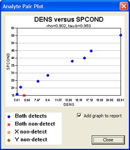
Figure 5.6 Analyte Pair Plot
This tool uses the Analysis of Variance dialog to compare groups of sample results against each other to find significant differences. To do this, you must first create a Group Type in VSP with two or more Groups in it. This is done by selecting Edit > Samples > Edit Group List, adding a Group Type, and then two or more Groups with that Group Type. When you are done creating a Group Type and set of Groups, select Edit > Samples > Assign To Group to assign samples to a group by clicking around samples on the map to enclose them in a shape.
Once samples have been assigned to groups, select Tools > Group Comparison / ANOVA and the dialog in Figure 5.7 will appear. First, select the Analyte you want to use in the comparison. Then select if you can assume normally distributed data or if you want to make no distributional assumptions. This determines if a traditional ANOVA will be used or the non-parametric version. Select the Group Type and then two or more groups that you wish to compare. Finally, select the confidence level you wish to test with, and a range of dates if you wish to do the comparison on a range of times in the data. At the bottom of the dialog, the group means, test statistic, and conclusion are shown, and if the initial F-Test was statistically significant, Group-to-Group Comparisons are shown.
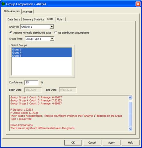
Figure 5.7 Group Comparison / ANOVA Dialog
For help during this section, please refer to the VSP Help Topic Options menu commands.
VSP allows the user two options when selecting how random numbers are generated. The random numbers are used to pick coordinates for sampling locations when the design calls for either a random-start grid or random placement of all points. The user selects the desired random number generator using Options > Random Numbers from the Main Menu. The two options are Pseudo-Random Numbers and Quasi-Random Numbers. The user "toggles" between these two options. This is shown in Figure 5.8. Note that once an option is selected, it remains active in the current project until changed. VSP is initialized with the Quasi-Random Numbers option active.
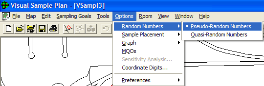
Figure 5.8. Menu for Selecting Type of Random Number Generator
Sampling locations (i.e., the x and y coordinates of the location) chosen with a pseudo-random number generator are not restricted in any way. The first location chosen and the tenth location chosen can be right next to each other or far apart, like throwing darts at a dart board. The locations where the darts hit can be clumped together or spread out, depending on chance.
Quasi-random numbers are generated in pairs. One member of the pair is used for the X coordinate; the other member is used for the Y coordinate. The sequence of paired numbers is generated in such a way that sample points tend to be spread evenly over a sample area. VSP's quasi-random-number generator uses Halton's Sequence. For a discussion of the algorithms used for both the pseudo- and the quasi-random number generator, see Version 2.0 Visual Sample Plan (VSP) Models and Code Verification (Gilbert et al. 2002).
If the current sampling design is being added to a study area with existing sampling locations, the quasi-random number generator will have no knowledge of those locations and might by chance put a new sampling location right next to an existing location. See the Adaptive-Fill option in Section 5.2.2 to handle the problem of avoiding existing sampling locations.
The Adaptive-Fill option allows the addition of "random" sampling locations in such a way as to avoid existing sampling locations. Adaptive Fill has to do with the placement of the sampling locations, not the number of samples. The basic idea is to place new sampling locations so as to avoid existing locations and still randomly fill the Sample Area. The current Sampling Design option determines the number of locations.
VSP usually places new sampling locations using the default option, Options > Sample Placement > Regular Random. When Regular Random is selected, the sampling locations produced by either of the two random number generators discussed in Section 5.2.1 are placed in the Sample Area without regard to pre-existing samples. In fact, VSP removes all previous sampling locations prior to placing the new set of sampling locations.
When the Options > Sample Placement > Adaptive-Fill option is selected, all pre-existing sampling locations are left in place, and new sampling locations are placed in the Sample Area using an algorithm to maximally avoid preexisting sampling locations. The Adaptive-Fill algorithm can be used with either random number generator. The Adaptive-Fill option is shown in Figure 5.9.
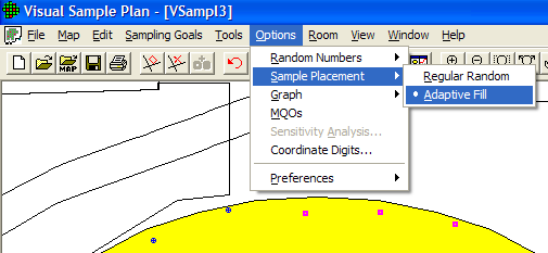
Figure 5.9. Adaptive-Fill Option for Sample Placement (Shown Here with Sample Area from Millsite Map)
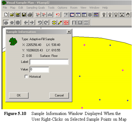 Note that in Figure 5.9 the original sampling
locations are marked with a circular symbol. In contrast, the
Adaptive-Fill sampling locations are marked with a square symbol. If
you right-click on a sampling-location symbol, a Sample Information dialog
will display the type of sample, the coordinates, and a label input field. The
label input field allows a specific sampling location to be given an ID
number or remark. The label information is displayed in the
Sample Information dialog, the report view, and the coordinate view. The
label is also exported along with other sample information when exported
to a text file (see Figure 5.11). See Figure 5.10
for an example of right-clicking on an Adaptive-Fill sampling location.
Note that in Figure 5.9 the original sampling
locations are marked with a circular symbol. In contrast, the
Adaptive-Fill sampling locations are marked with a square symbol. If
you right-click on a sampling-location symbol, a Sample Information dialog
will display the type of sample, the coordinates, and a label input field. The
label input field allows a specific sampling location to be given an ID
number or remark. The label information is displayed in the
Sample Information dialog, the report view, and the coordinate view. The
label is also exported along with other sample information when exported
to a text file (see Figure 5.11). See Figure 5.10
for an example of right-clicking on an Adaptive-Fill sampling location.
If the sampling locations are exported to a text file using Map > Sample Points > Export, an Adaptive-Fill location will be noted and any label the user might have added will be saved. An example text file is shown in Figure 5.11.
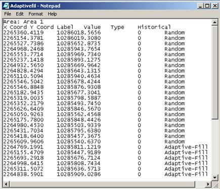
Figure 5.11. Sample Exported Text File of Sampling Locations
Graphs can be displayed with many different options. Figure 5.12 shows the options that can be selected using Options > Graph. Options are selected by clicking the option on or off. Once selected, that option will be in place for all Graphs. Note that we saw these same options in Chapter 4, Figure 4.3, by right-clicking on a Graph. Table 4.2 describes these options in more detail.
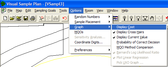
Figure 5.12. Graph Options
The Measurement Quality Objectives (MQO) module in VSP provides a way to extend the sampling design to consider not only the number and placement of samples in the field but also what happens in the measurement or analysis process. After all, it is the final result of the "measured sample value" that gets reported back to the project manager and used in statistical tests to make a decision.
There is a trade-off between taking more samples using a crude (i.e., less precise) measuring device vs. taking fewer samples using a precise measuring device and/or method. This is because total decision error is affected by the total standard deviation of the samples. The total standard deviation includes both sampling variability and analytical measurement variability.
There is also a trade-off between taking more measurements (i.e., replicate measurements) when using these less precise analytical measuring devices and/or methods vs. taking few measurements and using more precise analytical measuring devices and/or methods. The MQO module in VSP lets the user play "what-if" games with various combinations of sampling standard deviation, analytical (i.e., measurement) standard deviation, number of analyses (i.e., replicates) per sample, and number of samples to take. More discussion of this topic and the sample size equations behind the VSP calculations can be found in Version 2.0 Visual Sample Plan (VSP) Models and Code Verification (Gilbert et al. 2002).
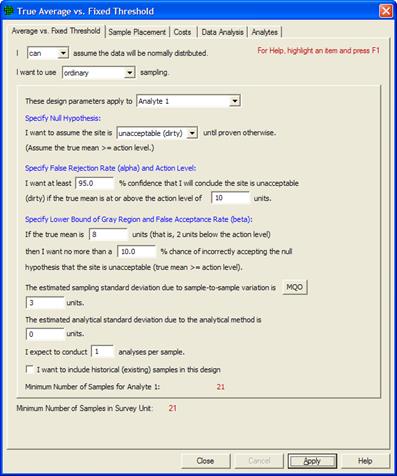
Figure 5.13. MQO Input Dialog Box with Default Values Displayed
The MQO option is selected from the dialog that pops up after a Sampling Design has been selected. The MQO option can also be toggled using Options > MQOs from the main menu. In Figure 5.13, we see a dialog box that contains the MQO button (Sampling Goals > Compare Average to Fixed Threshold). This dialog box allows you to provide additional inputs, such as the analytical standard deviation and number of analyses per sample.
Note that in situations where analytical methods are highly accurate, values of 0 for the Estimated Analytical Standard Deviation and 1 for the Analyses per Sample might be used. This means that the user-selected analytical or measurement method does not add a significant component of variability to the total standard deviation; i.e., the method provides essentially the same numeric value when repeated measurements are made on a sample. Using the input parameter values shown in Figure 5.13 and with these default MQO values, we get n =21 samples.
Now let's start changing the MQO input values. First, we change the Estimated Analytical Standard Deviation to 3. We still take only one analysis per sample. We see VSP now tells us we need to take 40 field samples to obtain the desired error rates we specified. This is shown in Figure 5.14.
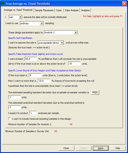
Figure 5.14. MQO Input Dialog Box Showing Positive Value for Estimated Analytical Standard Deviation with 1 Analysis per Sample
If we take two repeated measurements of each sample (Analyses per Sample set to 2), we see in Figure 5.15 that the number of field samples is now only 31.
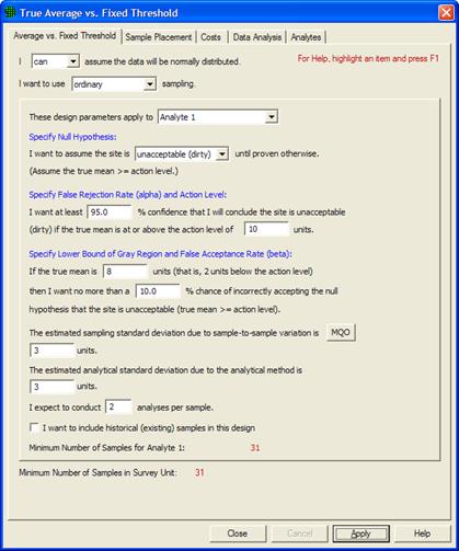
Figure 5.15. MQO Input Dialog Showing Positive Value for Estimated Analytical Standard Deviation with Multiple Analyses per Sample
You can try different values in the MQO input boxes and see the effect on the resulting number of field samples.
When you select the COSTS tab at the top of the screen, a new display and set of inputs is shown. This is shown in Figure 5.16. In this dialog box, we can enter costs for Field Collection (shown here as $100 per sample) and Analytical Cost per Analysis (shown here as $400 per analysis). This screen also provides a Cost Comparison between two possible options, Analytical Methods A and B. We see the Method A Analytical Standard Deviation of 3 that we entered on the previous screen. We can also enter an Analytical Standard Deviation for Method B. Initially, VSP displays the default values of 0 for Method B as shown in Figure 5.16. VSP displays the comparison for one, two, or three replicate analyses for only Method A because Method B has an analysis cost of $0.00.
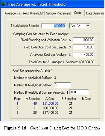 Next we show input values for Method B. Here,
we enter a Method B Analytical Standard Deviation of 4 (somewhat
higher than Method A), but with a lower Cost per Sample (shown
here as $100). In Figure 5.17 we see that
the Method Comparison is now filled in with the new values. The lowest
cost option (Method B with 1 Analysis per Sample) is highlighted in blue. Notice
that the lowest cost sampling design for this problem has the most field
samples, n =55. This is because Method B has a very low analysis
cost of only $100 vs. the much higher cost for Method A of $400. Therefore,
Method B can reduce the uncertainty in the final decision by allowing
many more field samples to be analyzed compared with Method A.
Next we show input values for Method B. Here,
we enter a Method B Analytical Standard Deviation of 4 (somewhat
higher than Method A), but with a lower Cost per Sample (shown
here as $100). In Figure 5.17 we see that
the Method Comparison is now filled in with the new values. The lowest
cost option (Method B with 1 Analysis per Sample) is highlighted in blue. Notice
that the lowest cost sampling design for this problem has the most field
samples, n =55. This is because Method B has a very low analysis
cost of only $100 vs. the much higher cost for Method A of $400. Therefore,
Method B can reduce the uncertainty in the final decision by allowing
many more field samples to be analyzed compared with Method A.
Note also that the sampling design will not automatically change to
the Method B case highlighted in blue. If you want a sampling design
based on Method B, you must update the Analytical Cost per Analysis
for Method A to match the Method B cost.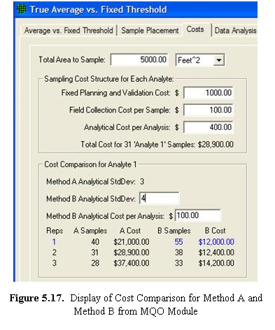
Then return to the One-Sample t-Test tab, change the Estimated Analytical Standard Deviation value to match the Method B value, and press the Apply button to get the Method B-based sampling design.
A graphical comparison of the analytical methods is shown in an overlay on the Decision Performance Curve when Options > Graph > MQO Method Comparison is checked. You must go to View > Graph to see the chart. Figure 5.18 shows an example.
The yellow circle is placed above the lowest-cost sampling design that meets the objectives. In this case, the circle is above a green bar representing the cost of using sampling design Method B with one analysis per sample.
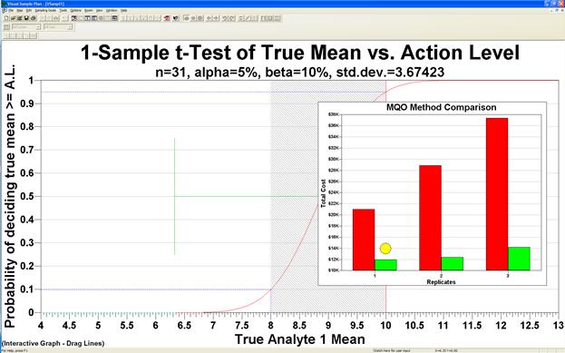
Figure 5.18. MQO Method Comparison Chart
This option accesses the sensitivity analysis parameters on the Report View. The sensitivity analysis parameters may also be accessed by right-clicking on the Report View itself. The example shown in Figure 5.19 is from the VSP Project File Example1.vsp. With View > Report selected, scroll down to the section on Sensitivity Analysis. Now select Options > Sensitivity Analysis, and the Dialog Box shown in Figure 5.19 is displayed. The user can do sensitivity analysis on up to 4 variables (only 3 are shown here), can select a starting and ending value for each variable, and can specify the number of steps for incrementing the variable. VSP displays the values for each step in Red below the Step window. For this example, in Figure 5.19, we say we want to see the number of samples required at values of the Standard Deviation s=1.2, and 0.6. For each of these levels, we want to look at three levels of Beta, and three levels of Alpha. VSP calculates sample size for each of these 2 x 3 x 3=18 options and displays the values in the Table.
This option is a very powerful tool for looking at "what if" scenarios and determining trade-offs for risk and cost. Tables for Number of Samples, Sampling Cost, or both can be displayed. Figure 5.20 shows 4 of the DQO Parameters being changed, and shows the results of the sensitivity analysis for both number of samples and cost.
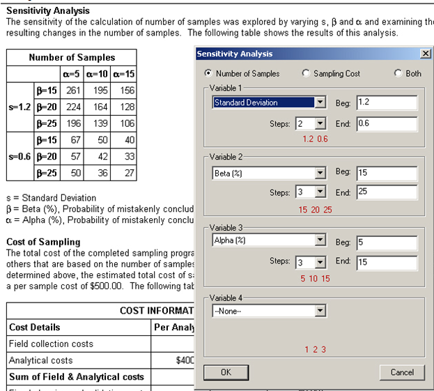
Figure 5.19. Sensitivity Analysis for 3 DQO Input Parameters. Results are shown for Number of Samples / Sampling Cost ($), as displayed in a table in Report View
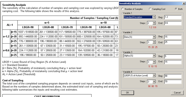
Figure 5.20. Sensitivity Analysis for 4 DQO Input Parameters. Results shown for Number of Samples / Sampling Cost ($), as displayed in a table in Report View
Selecting this option (Options > Coordinate Digits) brings up a dialog box where the user inputs the number of significant digits (after the decimal point) for displaying the X, Y, and Z coordinates in View > Coordinates.
Figure 5.21 shows the Preferences available in VSP. Table 5.1 provides a brief description of each Preference. Consult VSP Help > Help Topics > Menus > Options menu > Preferences for a more detailed discussion of each menu item.
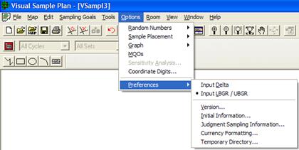
Figure 5.21. Preferences Available in VSP
Table 5.1. Preferences Menu Items
Input Delta |
This preference allows you to input the Delta parameter (width of the gray region) on all the design dialogs (as opposed to entering the LBGR / UBGR). This preference setting is persistent (remembered after exiting and restarting VSP) and affects all project files. |
Input LBGR / UBGR |
This preference allows you to input the Lower Bound of the Gray Region (LBGR) or the Upper Bound of the Gray Region (UBGR) on all the design dialogs (as opposed to entering the Delta parameter). This preference setting is persistent (remembered after exiting and restarting VSP) and affects all project files. |
Version |
This preference allows you to choose which sub-version of VSP you will use. The sub-versions of VSP eliminate some features and sampling designs that do not apply to the general goals of the chosen sub-version. |
Initial Information |
This preference shows you a dialog containing some practical information to help you use your chosen sub-version of VSP. It also provides some specialized contact information and help links. |
Judgment Sampling Information |
This option shows an informational dialog each time that judgment sampling is selected from the menu. |
Currency Formatting |
This preference allows you to change the currency used by VSP and the way cost values are formatted. |
Temporary Directory |
In order for the geostatistical routines to operate in VSP, temporary files must be written in the process. By default, VSP uses the temporary directory that is setup by the Windows system. Using this dialog, you can change the directory to any location you choose. |
For help during this section, please refer to the VSP Help Topic View menu commands.
The View Menu offers the user options for how VSP displays information. Table 5.2 gives a brief description of each option. Consult VSP Help > Help Topics > Menus > View menu for a more detail discussion of each menu item. Many of these items have been discussed previously in this manual and will be mentioned only briefly here.
Table 5.2. View Menu Items
Main Toolbar |
Shows or hides the main toolbar |
Map Drawing Toolbar |
Shows or hides the toolbar used for drawing on maps. |
Ranked Set Toolbar |
Shows or hides the toolbar used for ranked set sampling |
Room Toolbar |
Shows or hides the toolbar used for room manipulation |
Layer Bar |
Shows or hides the Layer Control Bar which includes a tree control for accessing and controlling various map features. |
Property Bar |
Shows or hides the Property Bar for quick access to view and edit the properties of certain project objects. |
Status Bar |
Shows or hides the status bar. |
Labels |
Shows or hides the sample labels on the map. Any combination of Labels, Coordinates, Local Coordinates and Values can be displayed. |
Background Picture |
Shows or hides the background picture. |
Transparent Sample Area |
Allow background picture to be seen behind sample areas. |
Largest Unsampled Spots |
Shows or hides the largest unsampled spots. |
All Grid Cells |
Shows or hides all grid cells used for Grid Cell sampling and Adaptive Cluster sampling |
Grid Lines |
Shows lines around Grid Cell samples and Adaptive Cluster samples. |
Leading Edge |
Shows only the leading edge of an open-type sample area |
Map Scale |
Shows or hides the coordinate scale on the map. |
Map Legend |
Shows or hides the map size legend. |
Color Legend |
Shows or hides the color legend. |
Transect Corners |
Shows the coordinates at the corners of transects |
Kriged Data |
Shows or hides the Kriged results from "Geostatistical mapping of anomaly density" or "Geostatistical Analysis". |
Anomalies |
Shows or hides the anomaly markers on the map for UXO designs. |
Transects |
Show or hides the transects on the map for UXO designs. |
Target Flags |
Shows or hides the target flags on the map for UXO designs. |
Room North Arrow |
Shows or hides the north arrow in the room view. |
Room Perspective Ceiling |
Shows or hides the ceiling in the perspective room view. |
Map |
Change current project view to map view. |
Graph |
Change current project view to graph view. |
Report |
Change current project view to report view. |
Coordinates |
Change current project view to coordinate view. |
Room |
Change current project view to room view. |
3D |
Changes the current window to a 3D view. |
Zoom In |
Increase the map view size. |
Zoom Out |
Decrease the map view size. |
Zoom Max |
Change map view size to fit window |
Zoom Window |
Increase map view size to selected area. |
Pan |
Move the visible portion of the map. |
Rotate |
Rotates or tilts the map in the 3D view window. |
For help during this section, please refer to the VSP Help Topic Cost page.
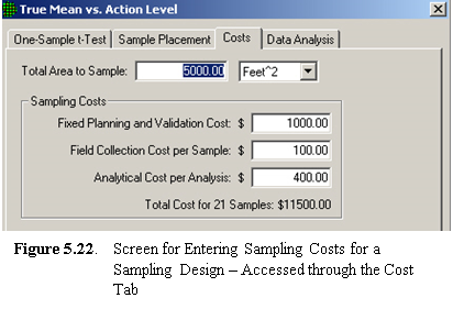 VSP allows users to enter sampling costs so that
the total cost of a sampling program is available. Once a sampling
design is selected and the DQO inputs have been entered into one of the
dialog boxes, click on the Costs tab to enter costs. A
sample Costs screen is shown in Figure 5.22. The
inputs for this example were entered in the Dialog Box shown in Figure
5.13.
VSP allows users to enter sampling costs so that
the total cost of a sampling program is available. Once a sampling
design is selected and the DQO inputs have been entered into one of the
dialog boxes, click on the Costs tab to enter costs. A
sample Costs screen is shown in Figure 5.22. The
inputs for this example were entered in the Dialog Box shown in Figure
5.13.
VSP enables you to break down costs into the following categories:
· fixed planning and validation costs - This is the fixed cost that is incurred, regardless of how many samples are taken. Examples of fixed costs are the cost to mobilize a sampling crew and get the equipment into the field.
· field collection cost per sample - This is the per-sample field collection cost. Examples of per-unit field costs are the costs paid to technicians to collect the sample and package and transport it.
· analytical cost per analysis - This is the cost to analyze a specimen or a sample. As discussed in Section 5.4, you can specify how many repeated analyses you want taken per sample or specimen.
VSP calculates a total cost for the design specified, shown here as $11,500. Total cost is the sum of the fixed cost, shown here as $1,000, plus per-sample field collection cost of $100, plus analytical cost per analysis of $400, multiplied by the number of samples, 21. No duplicate analyses were specified, so the total per-unit cost is $500. Thus, the total sampling cost is $1000 + 21 x $500=$11,500.
The hot spot sampling goal has some unique cost features. First, total costs are displayed in one of the tables in the Report View. Second, you can specify a cost as a design criteria and VSP will calculate the number of samples to meet that goal (see Figure 3.33). This is done by selecting from the main menu Sampling Goals > Locating Hot Spots > Assume no false negative errors.
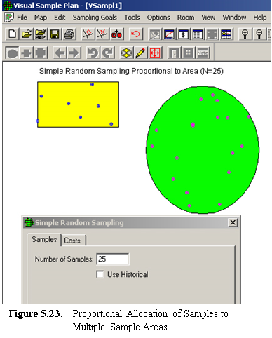 VSP allows
the user to select multiple areas as sampling areas. All the examples
shown so far involved a single Sample Area. When multiple areas are
selected, VSP allocates the samples to the areas in proportion to the
area of the respective individual sample areas. For example, if one
area is twice as large as the other sample area, it will receive twice
as many sample points. This is shown in Figure 5.23.
VSP allows
the user to select multiple areas as sampling areas. All the examples
shown so far involved a single Sample Area. When multiple areas are
selected, VSP allocates the samples to the areas in proportion to the
area of the respective individual sample areas. For example, if one
area is twice as large as the other sample area, it will receive twice
as many sample points. This is shown in Figure 5.23.
In Figure 5.23, we show two sample areas -- a rectangle and a circle. We next assume that a sampling-design algorithm not currently in VSP called for n =25 samples. Using option Sampling Goals > Non-statistical sampling approach > Predetermined number of samples, VSP allocated 7 of the 25 requested samples to the rectangle and 18 to the circle. This is because the circle covers an area approximately three times larger than the rectangle.
Note that when multiple sample areas are drawn on a Map, you can select or deselect sample areas using Main Menu option Edit > Sample Areas > Select/Deselect Sample Areas. Alternatively, you can select or deselect a sample area by clicking on it with the mouse.
The Change Color option can be used to change a sample area's color. First, select those sample areas to be given a new color. Then use the Edit > Sample Areas > Change Color sequence and choose the new color for the currently selected sample areas.
Note that when multiple sample areas are selected, VSP-derived sampling requirements assume that the decision criteria and summary statistic of interest (mean, median) apply to the combined sample areas and not to the individual areas.
For help during this section, please refer to the VSP Help Topic Data Analysis.
For some sampling goals, VSP allows the user to input the results of a sampling effort and obtain certain basic analyses of the data, including summary statistics, plots of the data, and results of statistical tests performed on the data. VSP provides a statement of the conclusion(s) that can be drawn based on results of the statistical tests. Only selected tests appropriate for the design in question are displayed. The tests included in VSP are standard statistical tests and are included in VSP for the convenience of the user so a separate software package for analyzing results is not needed.
Figure 5.24 shows a Dialog Box that appears when the user selects the Data Analysis tab for Compare Average to Fixed Threshold for normally distributed data.
In Figure 5.24, we see five options: Data Entry, Summary Statistics, Tests, and Plots. Data Entry is a user input screen for inputting data values. Summary Statistics displays VSP calculations, shown in red, of selected summary statistics of the data input in Data Entry. The Tests tab displays the results of computations done within VSP to execute various tests and make various calculations. The tests are of two types:
Tests of the assumptions underlying the statistical tests (e.g., the normality assumption for the One Sample t test), and
Statistical tests to test the Null vs. Alternative Hypothesis for the sampling goal selected
Calculations made by VSP are
Upper Confidence Limit (parametric and non-parametric) on the Mean and on Percentiles, and
A count of the number of sample points or grid locations that exceed the Action Level.
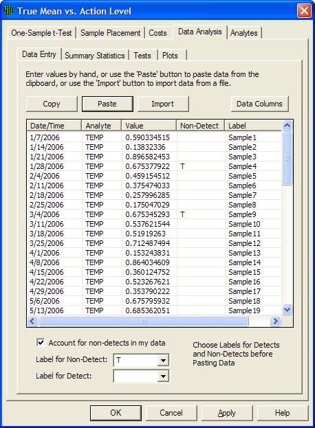
Figure 5.24 Data Analysis Tab for the One-Sample t-Test, Data Entry Dialog Box
Output from VSP, and conclusions that VSP determines can be drawn based on the test results and calculations, are shown in red on the Tests screen. The Plots tab shows VSP-generated graphical displays of the data.
Checking the Account for non-detects in my data box on the data entry tab allows the option of designating some Values as non-detects. This implies the true Value is somewhere between 0 and the Value shown. In Figure 5.24, data entries with non-detects are identified by a "T" and detects are identified by a blank cell in the Non-Detect column. Different options for differentiating non-detects from detects are available in the Label for Non-Detect and Label for Detect drop downs. The methods used for other data analysis functions will sometimes change due to the presence of non-detects.
Not all sampling designs in VSP have the Data Analysis tab - either because analyzing sampling results is not a part of the sampling goal, or because the analysis portion of the sampling goal has not been sponsored. For example, Locating a Hot Spot does not have a Data Analysis tab because the result of sampling is whether or not there has been a hit at any sampling location, which this doesn't require data analysis. Similarly, Estimate the Mean > Can assume will be normally distributed > Adaptive Cluster Sampling does not have a Data Analysis tab because the sampling goal is interactive and does not require a statistical test. Some sampling designs, like Collaborative Sampling, have a Data tab for inputting sample results, but not a Data Analysis tab.
For brevity, the Data Analysis for only a few sampling designs will be discussed below. Consult the Help function for individual designs for further information.
Data can be entered into VSP in one of two ways: manually or "cut and paste" from another file. To manually enter values, click the mouse in the first line in the input box under Value, enter the numeric value for a sampling point, hit Enter or Tab, and move to the next line for more input. If the data are in another software package such as Excel, use the Windows clipboard to copy the data, then hit Paste to get the data into VSP. The data to be pasted into VSP must be one entry per line in the originating source. You can manually add more input values to a set of Pasted values by clicking on the last data value in the input box, hit Enter or Tab, and start entering more data values on the next empty line. You must hit the OK or Apply button at the bottom of the screen to save your values in a Project file. Figure 5.24 shows 60 values pasted into VSP from an Excel spreadsheet.
Figure 5.25 shows summaries of the data input under Data Entry. The values for the summary statistics are shown in red. The summary statistics, when shown, are the same for all sampling designs.
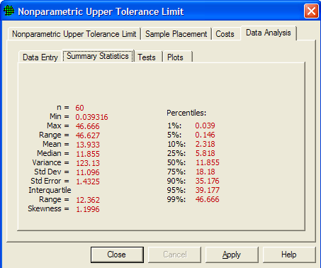
Figure 5.25 Summary Statistics for Data Values Entered on Data Entry Screen
The tests and calculations required by VSP to draw conclusions based on the data input under Data Entry are the core of VSP's data analysis. After telling the VSP user how many samples to take and where to take them, the next most important function of VSP is to tell the user what conclusions can be drawn based on the data. But prior to drawing conclusions, VSP must make sure the assumptions on which the tests and calculations rely are valid.
The tests in VSP vary by the Sampling Goal selected, and the assumptions made. The tests shown in the screen captures below are an example of the types of tests contained in VSP. Not all data analysis options are shown below.
The One-Sample t test is used to test the null hypothesis True Mean >=Action Level. However, the t test relies on the assumption that the data are normally distributed. So the first test VSP performs is to test the normality assumption. Two tests are available in VSP for testing for normality:
Shapiro-Wilk Test (also called W test) when the number of data points do not exceed 50, and
Lilliefors Test when the number of data points are greater than 50.
Our sample size was n=60, so the Lilliefors test was used. In Figure 5.26a we see the Lilliefors test results indicate we cannot assume normality (i.e., test statistic of .12961 > critical value of .11438 so we reject the assumption of normality).
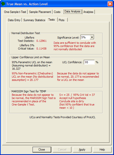
Figure 5.26a Tests for Comparing the True Mean vs. Action Level
With the normality assumption rejected, we now know we must use a non-parametric test to test the null hypothesis that the True Mean >=Action Level. The test we use is to compare the Non-Parametric UCL on the mean to the action level. We see that the Non-Parametric UCL on the mean is 20.177 which is greater than the Action Level of 10, so we cannot reject the null hypothesis, and we can conclude the site is dirty.
In Figure 5.26b we see the tests VSP executes in order to make confidence statements on a percentile of the population. For example, the goal may be to be able to state with 95% confidence that at least 95% of the values in a population are less than the action level, and therefore the decision unit is contaminated (see Fig 3.47 for a description of the problem). The test is to calculate the Upper Tolerance Limit on the 95th percentile of a population and compare it to the action level. Note: A one-sided upper tolerance limit on the Pth percentile is identical to a one-sided upper confidence limit on a Pth percentile of the population. The maximum value of a data set is the non-parametric UTL.
In this example, since the sample size was n=60, the Lilliefors test was used. We see that the Lilliefors test rejects that the data are normal, so VSP recommends comparing the nonparametric UTL to the Action Level for deciding whether the unit is contaminated. Since the nonparametric UTL of 46.666 is greater than the action level of 10, we conclude the site is dirty (i.e., less than 95% of the population is less than the action level of 10). VSP also calculates a parametric UTL of 36.371 but recommends not using it in the test.
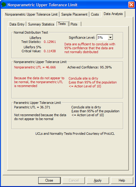
Figure 5.26b Tests for Making Confidence Statements on a Percentile of a Population
VSP provides three graphical summaries of the data: histogram, box-and-whiskers plot, and quantile-quantile plot (also called the Q-Q plot, or the probability plot). Some modules may have additional plots available. The pull down menu is used to select one of the three plots. The graphical displays provide information on the spread of the data, and can also be used to give a visual assessment of the normality assumption.
Figure 5.27 shows a histogram of the data. The red line shows the shape of the histogram if the data were normally distributed. Consistent with the results of the Lilliefors Test, the data do not appear to be normally distributed.
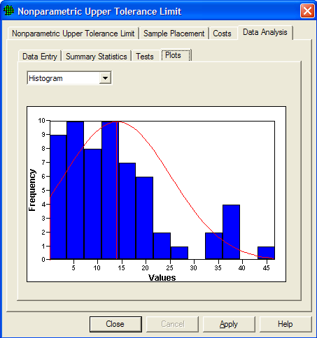
Figure 5.27 Histogram of the data
Figure 5.28 shows a Box-and-Whiskers plot of the data. The Box-and-Whiskers plot is composed of a central "box" divided by a line, and with two lines extending out from the box, called the "whiskers". The line through the box is drawn at the median of the data (i.e., the 50th percentile). The two ends of the box represent the 25th and 75th percentiles of the data, also called the lower and upper quartiles of the data set. The sample mean is shown as a red "+". The upper whisker extends to the largest data value that is less than the upper quartile plus 1.5 times the interquartile range (upper quartile - lower quartile). The lower whisker extends to the smallest data value that is greater than the lower quartile minus 1.5 times the interquartile range. Extreme data values (greater or smaller than the ends of the whiskers) are plotted individually. If the data are normally distributed, the box and whiskers appear symmetrical, with the median midway between the ends of the box (i.e., the 25th and 75th percentiles), and the mean is equal to the median. The plot in Figure 5.28 is not symmetrical, consistent with the non-normality conclusion discussed above.
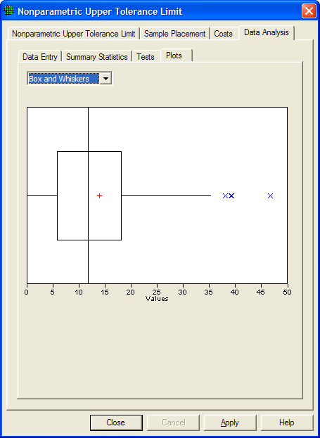
Figure 5.28 Box-and-Whiskers Plot
The Q-Q plot graphs the quantiles of a set of data against the quantiles of a specific distribution. We show here the normal distribution Q-Q plot. The red line shows quantiles of a normal distribution plotted against quantiles of a normal distribution - i.e., a straight line. If the graph of data plotted against quantiles of a normal distribution (shown as blue x's) fall along the linear line, the data appear to be normally distributed. In Figure 5.29 the tails of the data deviate from the red line, indicating the data are not normally distributed.
For more information on these three plots consult Guidance for Data Quality Assessment, EPA QA/G-9, pgs 2.3-1 through 2.3-12. (http://www.epa.gov/quality/qa_docs.html).
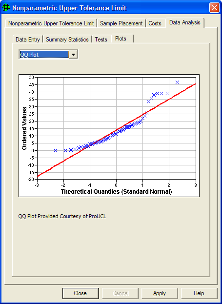
Figure 5.29 Quantile-Quantile (or Q-Q) Plot